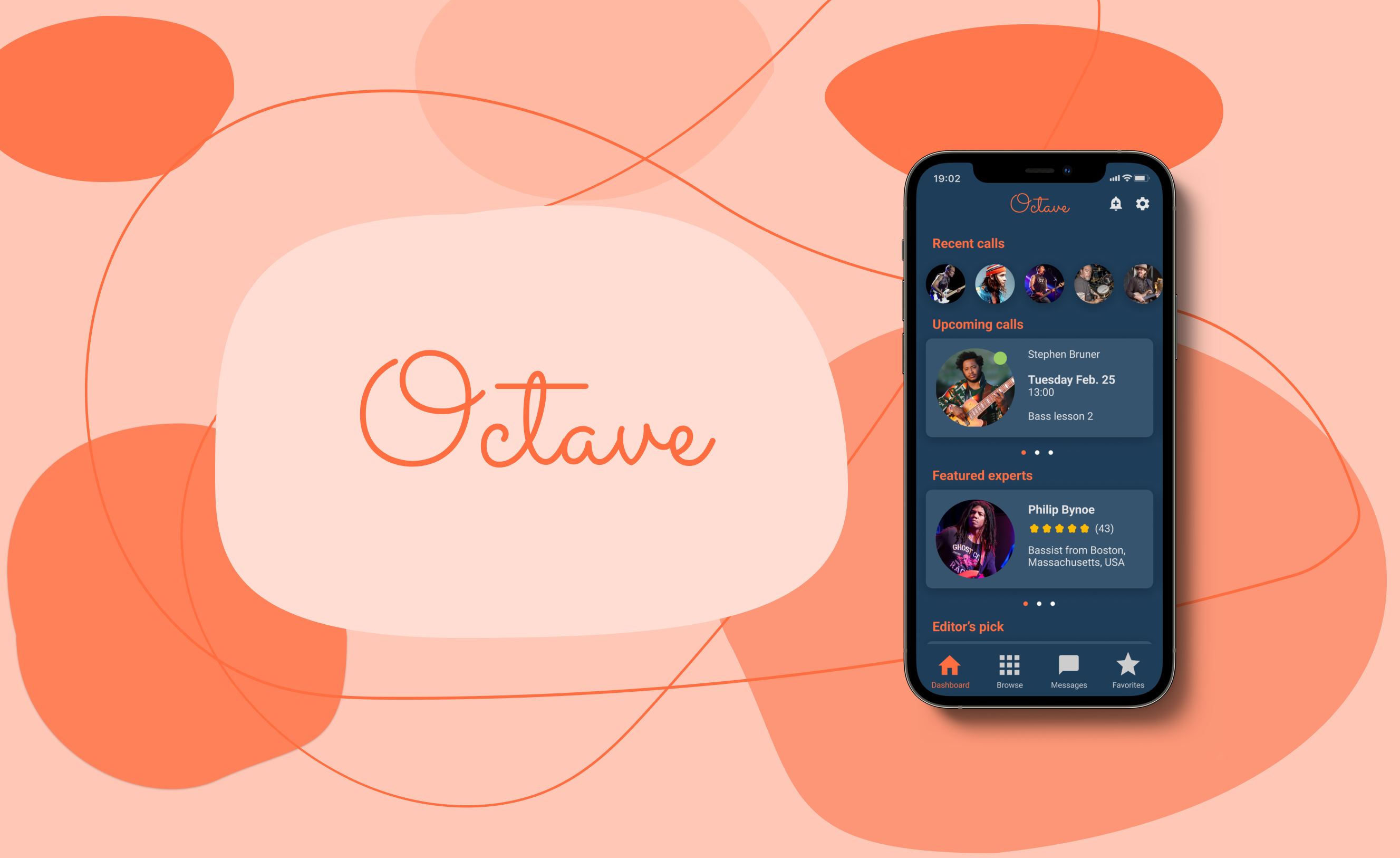
Octave is a music education mobile app that combines aspects of traditional in-person music tutoring and online learning to create a best-of-both-worlds solution for learning musicians. It allows users to connect with expert musicians on the platform and have access to high quality tutoring and feedback at their convenience.
The project was inspired by the observation that there are many high-quality learning apps available for languages and school subjects, but few comprehensive learning platforms for musicians. The project brief was to address this gap and design an app to make learning instruments more efficient and accessible for players of all levels.
I went through the scope of the UX design process for this project - from initial concept to final visual interface - as the sole designer.
I started foundational research to try to understand the strengths and shortcomings of currently available ways of learning music.
I conducted a SWOT analysis of two popular online learning platforms, Tutorful and Yousician, to get a reference point for how other app-based solutions had approached this problem.
.png)
The analysis revealed that they are respectively strong in offering 1-on-1 tutoring and building trust in the platform by including tutor ratings and reviews (Tutorful) and catering to music learners across a range of instruments (Yousician).
However, they were both weighed down by an unrefined and clunky user experience. In addition, Yousician's teaching style - based around an interactive mobile app and video materials - felt inefficient and lacked feedback and support for the learner. They also both faced competition from free online learning resources like as YouTube tutorials and dedicated online music forums.
I also conducted user interviews with people who had previous experience learning instruments to get a first-hand account of the problems they experience. This would provide the basis for the user problems the app would focus on solving. The goal of the research was to explore the following:
- What are the user pain points: where do existing methods of learning - both online and offline - fall short?
- What are typical user habits around music learning?
- How could an app-based solution help address the problems that music learners face?
I reviewed the interview transcripts to identify emergent themes using an affinity map.

The problems and habits around music-learning that arose were varied and multi-faceted. I condensed the insight into four primary themes.
The advice users get with online resources is often from other amateurs and not high quality. People are very interested to get good quality feedback from professional musicians. They also want to access advice that’s directed to more advanced players.This suggests that the competitive threat of free online resources highlighted by the SWOT analysis in reality is limited.
Learning resources like books and video tutorials are sub-optimal because they often lack detail and don’t allow for any real-time feedback with a teacher. 1-on-1 tutoring is the preferred way of learning for most, but attending instrument lessons in person is often inconvenient. This was in line with the weaknesses identified in the SWOT analysis and further confirmed the demand for 1-on-1 music teaching.
Users want musicians who play similar type of music to advice them but find it difficult to reach these people.
In addition to receiving tutoring in their instruments, people are also very interested in getting feedback on their recordings. However, they are again concerned about the quality of feedback they get online.
Using this insight, I created two user personas to convey the most pertinent user qualities. These were to act as a reference for the hypothetical user throughout the rest of the design process.
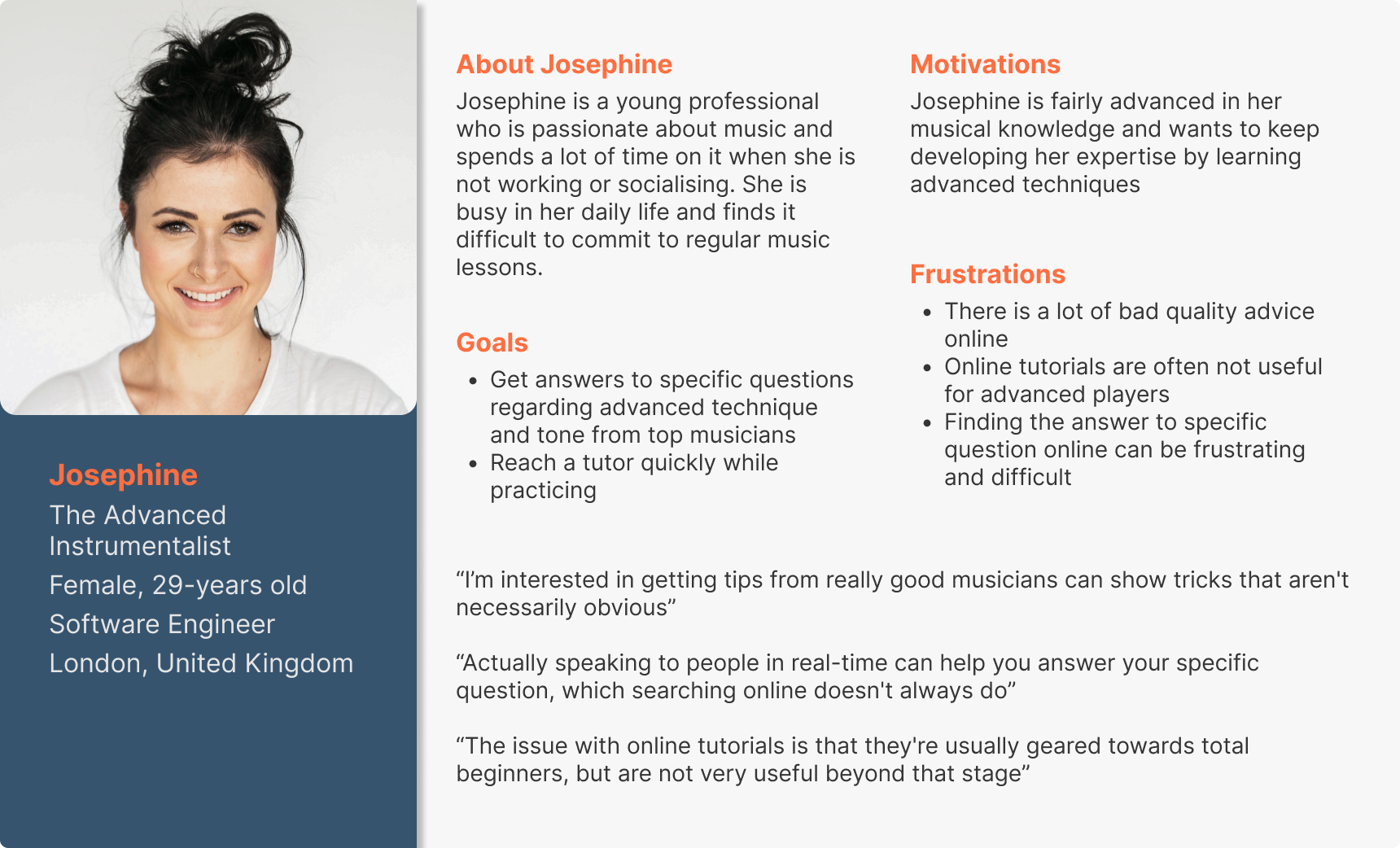
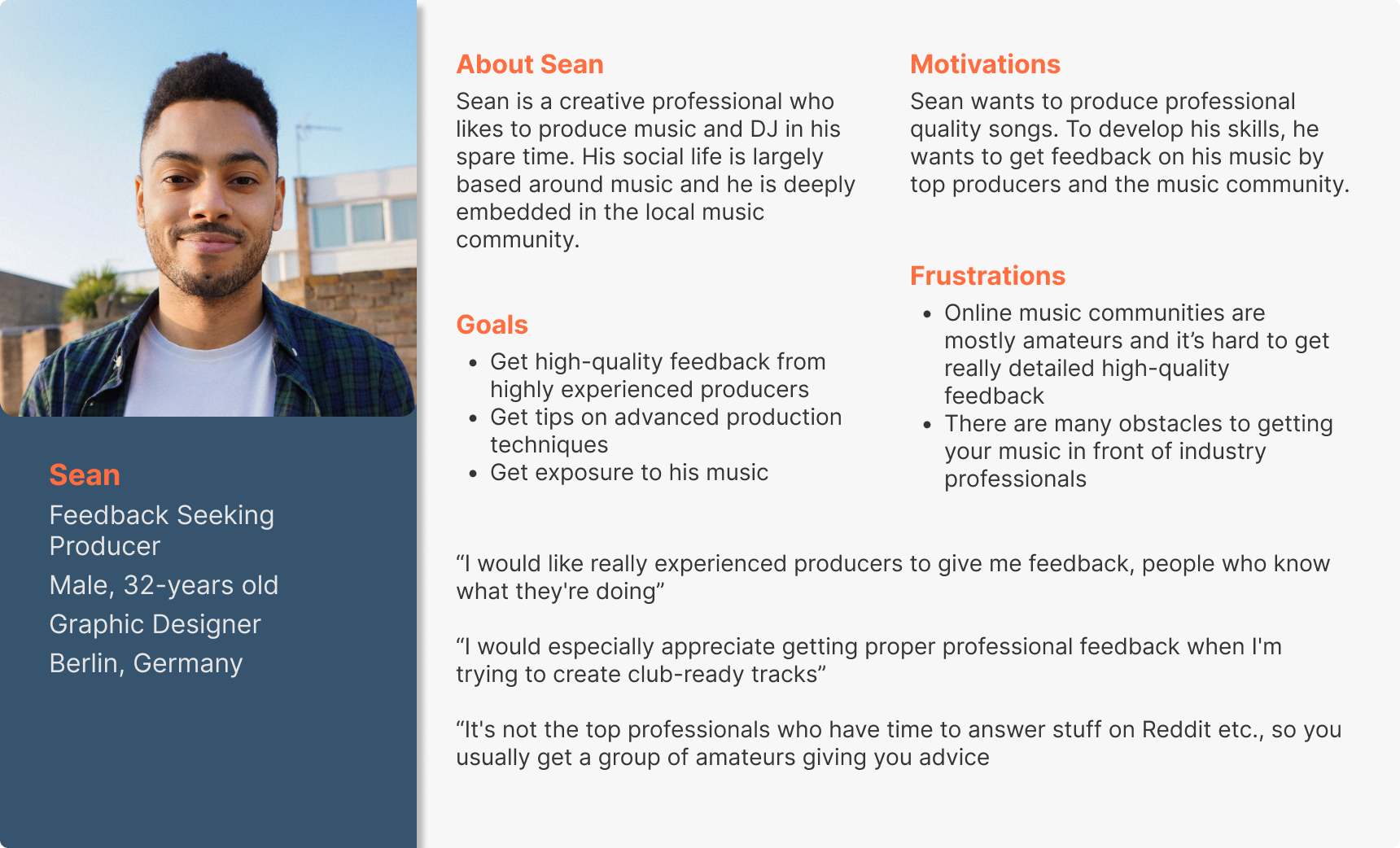
The next step was to outline how an app-based solution could cater to these users considering insights from both the competitive analysis and user interviews. Since there were many highlighted problems, I prioritised them and limited the scope of the project to four aspects that I considered to be most important.
The app should focus on facilitating 1-on-1, real-time contact with the expert. It should include contact options like text chat, phone calls and video calls to allow the user to contact the expert in whatever way is most convenient to them.
The app should enforce quality control on the experts by focusing on attracting professional musicians. It should also provide detailed bios that include information about the experts’ musical background and qualifications and thus facilitate trust with users.
The app should make it easy for users to find an expert that is right for them. It should therefore include a way to browse experts by instrument and genre and provide detailed information about their backgrounds and musical orientation.
The app should allow people to submit their songs to be reviewed by expert musicians. This was outside the scope of the original plan for the app, but it was a specific request many people raised in the user interviews, so it was added as a priority feature.
The focus of this project was on the dashboard section of the site that hosts all the functional aspects of the platform.
Now having preliminary solutions, I considered how the app should be structured to best deliver them. I first identified two main tasks that were the most relevant to what the users would be using the app for:
1. Finding and contacting an expert (Josephine)
2. Submitting a song to be reviewed by an expert (Sean)
I first created user flow diagrams to outline the actions required to carry out the tasks.
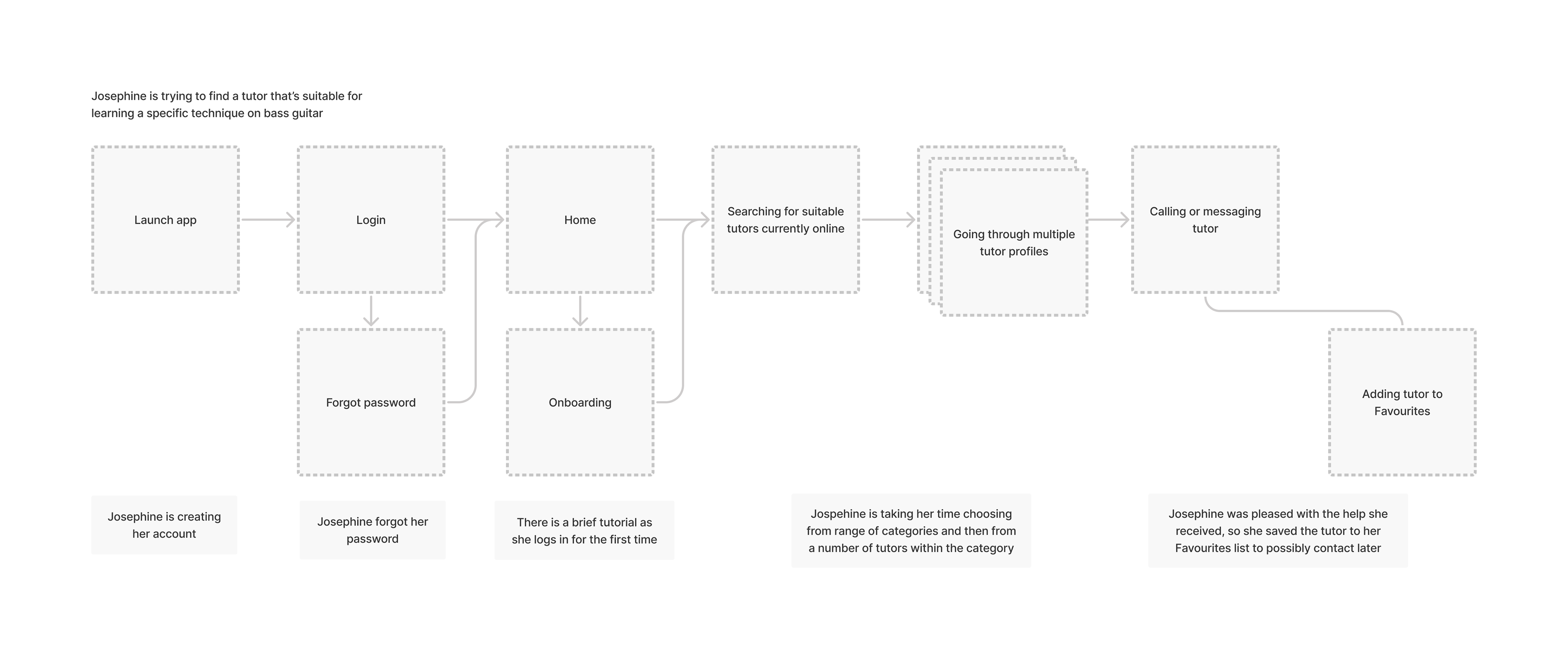
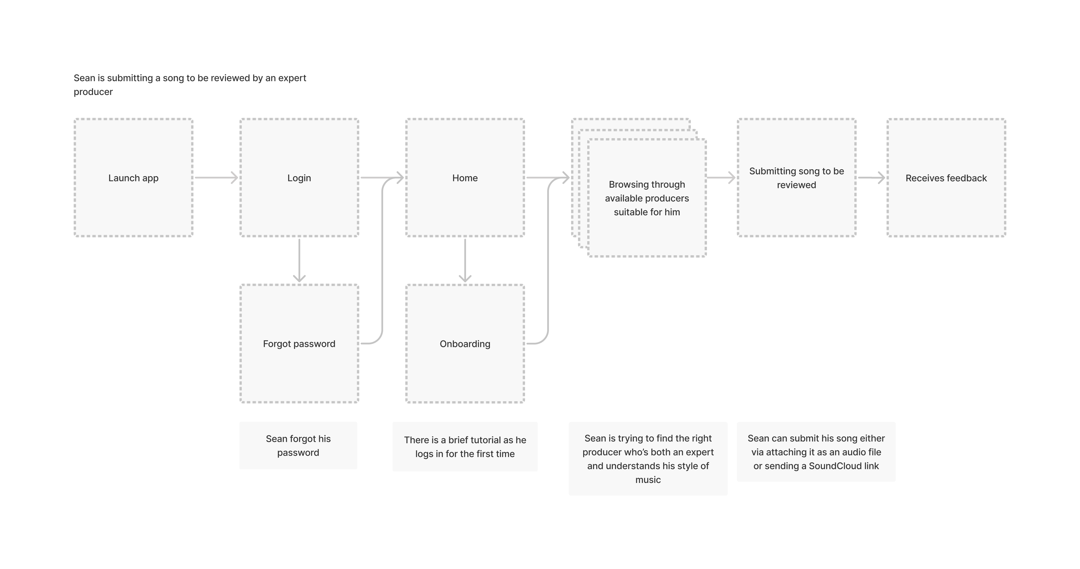
With these diagrams, I had a preliminary understanding of the main components of the app. I then created a sitemap to formally outline the structure and add any necessary pages that were outside the scope of the user tasks.
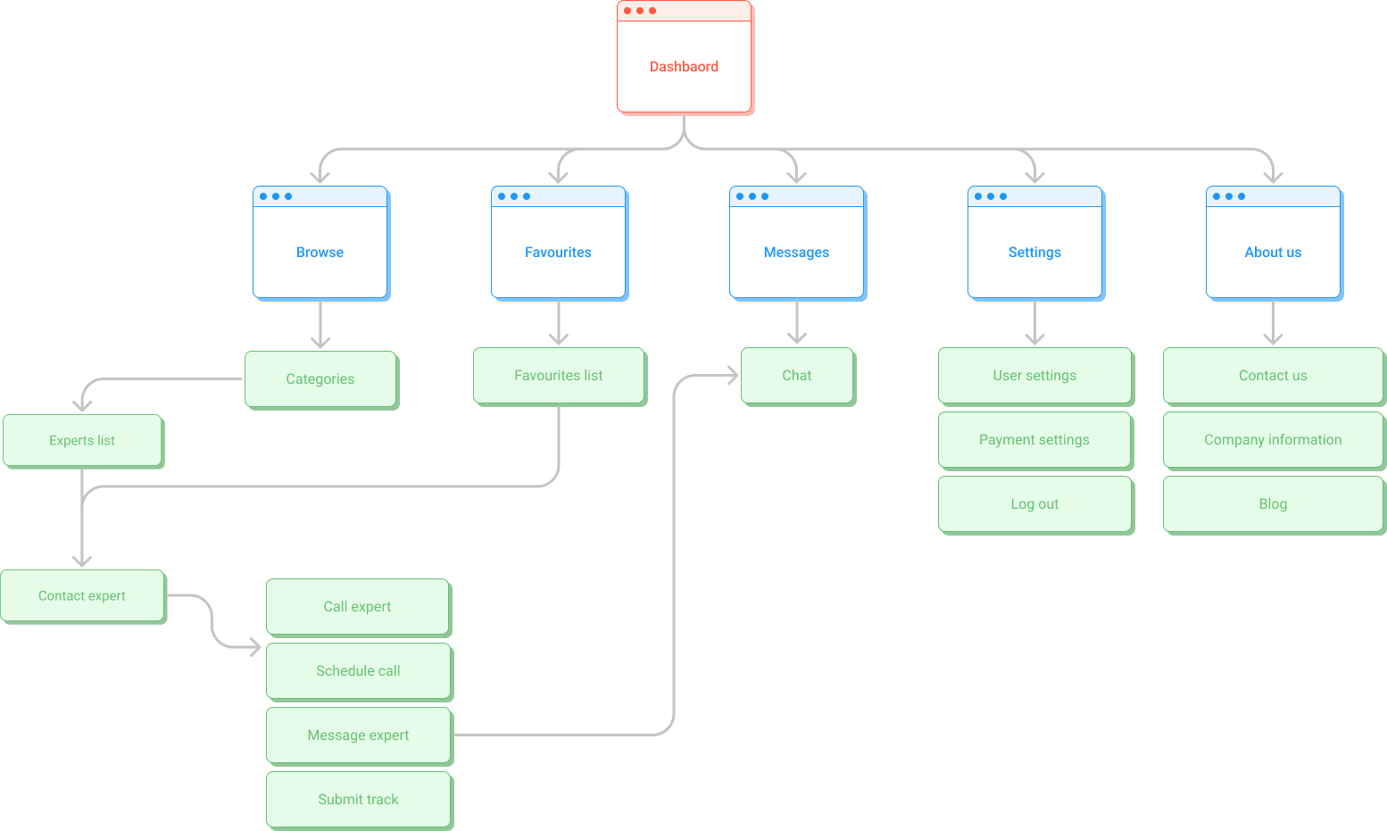
At this point, I conducted a card sorting exercise with participants to ensure that the proposed grouping of pages made sense to users.
The results showed that the groupings were generally intuitive and there was no need to amend the sitemap in a significant way.

I then created two user journey maps, one for each user persona, to help me empathise with the users’ thoughts and feelings at different stages of the tasks. I based these around hypothetical real-life scenarios in which they might be using use the app.
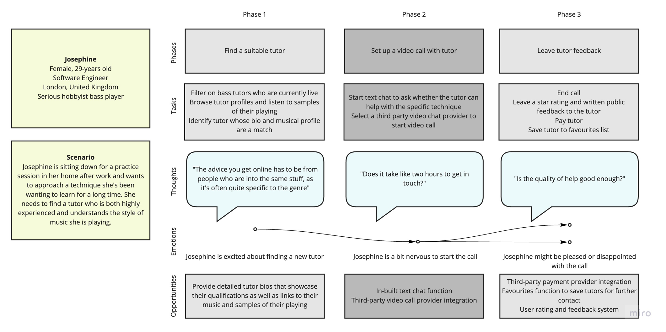

With a structure in place, the next stage was to produce the design. I started with hand-drawn low-fidelity wireframes and refined them further with mid- and high-fidelity wireframes, adding detail and amending the design with each subsequent stage. I gathered feedback from the team I was working with in each stage.
This iterative process ensured that any design flaws were caught early on to avoid having to make major changes later.
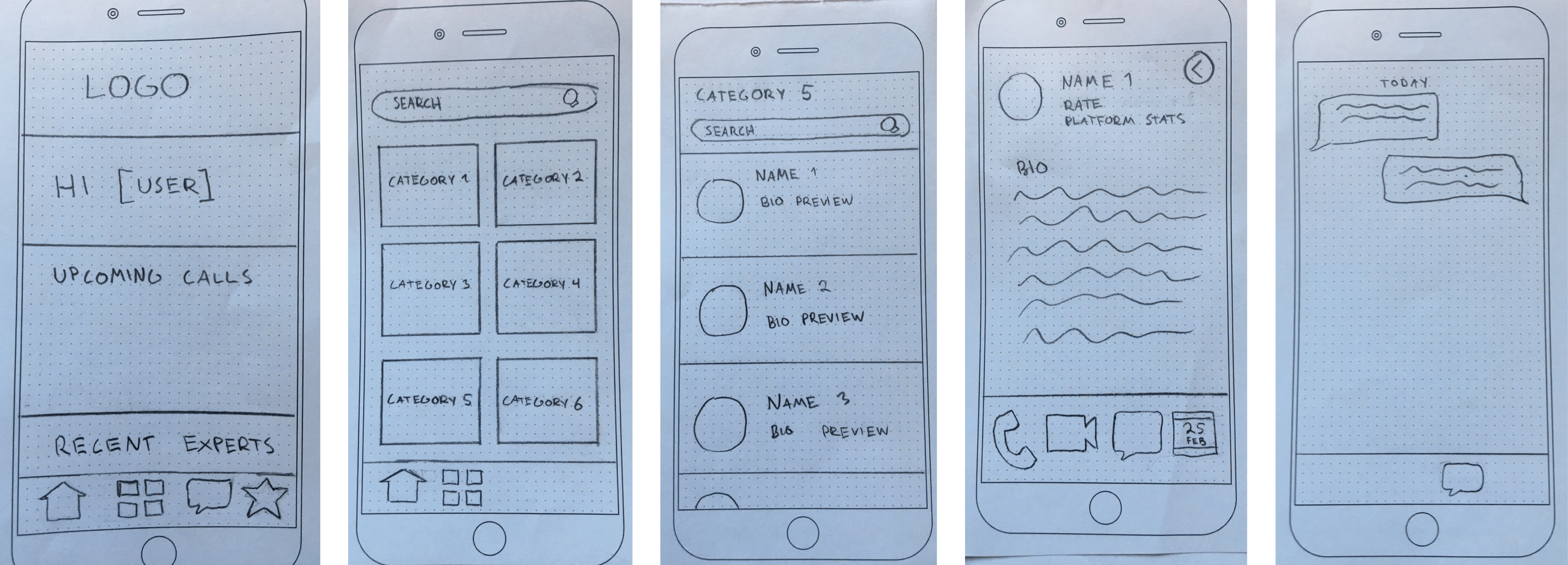
The first iteration was a set of simple hand-drawn sketches that outlined basic functionality of the user tasks. Feedback from the team suggested that the user flows were intuitive and easy to understand as presented.
The design was transferred into a digital medium using Figma. The organisation of visual elements was refined by considering spacing more carefully. Some details from the low-fidelity wireframes were omitted for the sake of brevity.
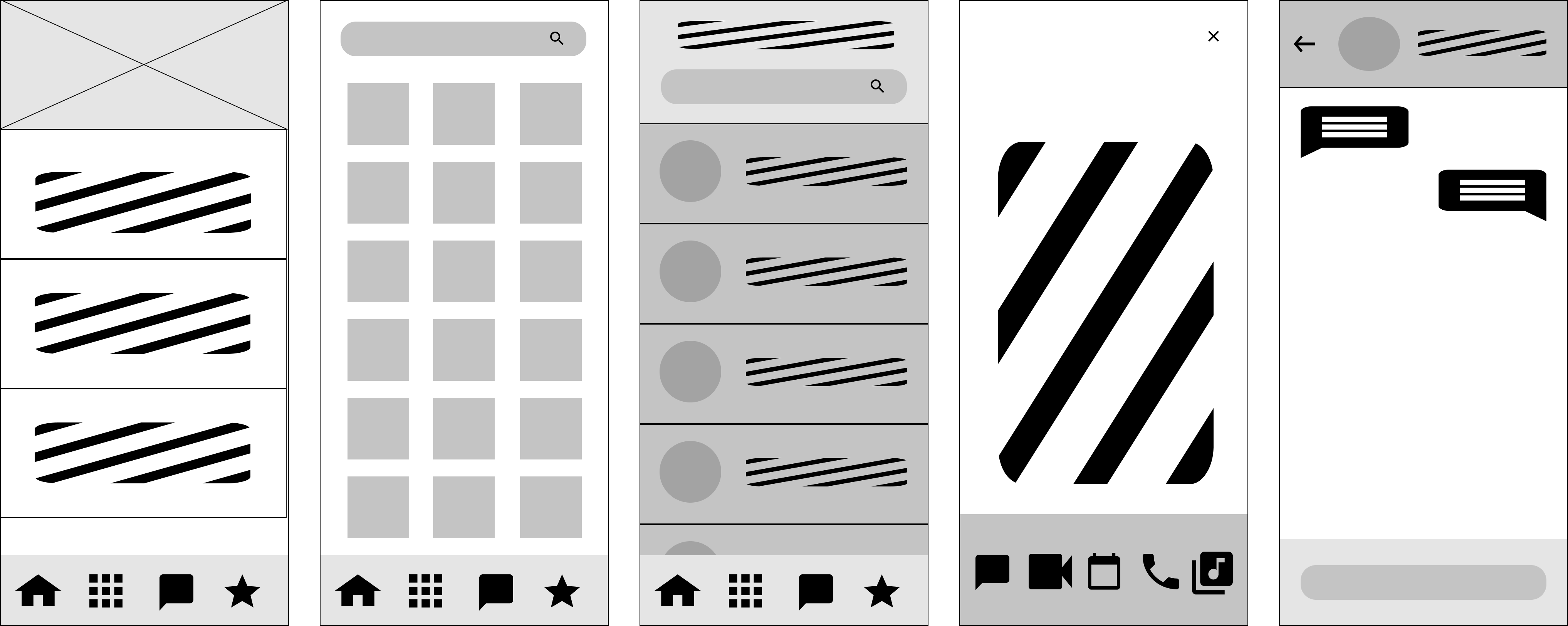
The next iteration was to function as a preview of the final product, so it included specifics of the UI, such as finalised icons, text, and refined spacing and placement of visual elements. Some features were also added or amended at this stage, such as the instrument/genre toggle in the browse page and the contact option bar in the expert bio.
This iteration was turned into a clickable prototype in Figma for usability testing.

Once I had a clickable high-fidelity prototype, it was time to test the design with real users.
I conducted remote usability tests with six participants to see how easily they could navigate the app and complete the two primary tasks on the app (finding and contacting an expert and submitting a song for review). In essence, the objective was to find out whether using the app was intuitive and easy to learn.
I collected instances of user errors, quotes and general observations from the tests and created an affinity map to organise the findings.

I collected the results into a rainbow spreadsheet, which you can view via the below .Rainbow spreadsheetI rated the errors that emerged during testing on the Jakob Nielsen scale to get a sense of their severity. Organising the findings in this way made it easier to prioritise the issues and opportunities that arose from the tests.
I also measured the success rate of users completing the tasks. Most users were able to successfully complete both tasks without prompting, with a success rate of 0.9 for finding and contacting an expert and 0.8 for submitting a song to be reviewed.
The main insights and the suggested actions that arose were:
Problem 1: Users were expecting to be able to get to other contact options from the chat page, but this navigation option did not exist (high severity)
Action: Add shortcuts to other contact methods from the chat page
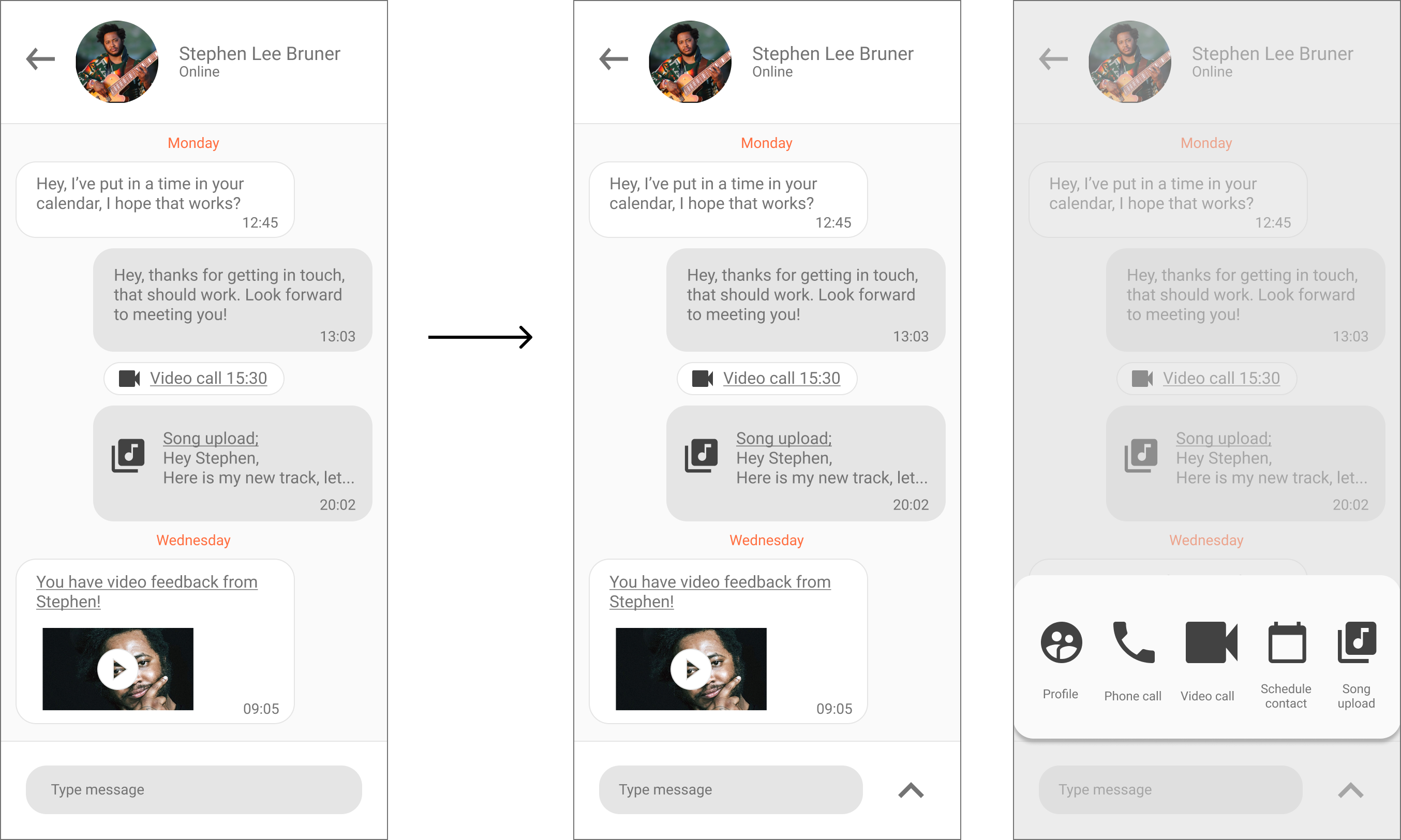
Problem 2: Users wanted to have a centralised place that would show all communication history with the expert (high severity)
Action: Make the chat page the centralised place for all contact history, including past calls, invoice history etc.
Problem 3: Link to Song Upload from expert profile didn't work when going through Favourites (high severity)
Action: Fix link in the prototype
Problem 4: Users wanted to see videos of the experts showing their playing in the bios (medium severity)
Action: Add video and audio clips into expert profiles

Once the prototype had been tested and verified and the appropriate changes made, it was time to finalise the visual design. This included adding colour, finalising UI elements, imagery, spacing, placement and hierarchy of visual elements. The final prototype was also populated with more placeholder content, including more experts in the expert listings page and links to featured experts and related articles in the dashboard, for a more realistic user experience.
I also created a design language system to ensure visual consistency across the app. You can access it from the below link.Design language system
Another crucial step was considering accessibility criteria. The designs were mostly compliant with the Web Content Accessibility Guidelines in terms of use of colour, text size, and not breaking familiar UI patterns unless needed.
However, some amendments were made to improve usability to users with visual impairments, such as colour blindness. For example, colour contrast was increased in some screens to make the app more legible, such as the large scale text on primary buttons. The text colour contrast against the background was raised to be at least 3:1.
The below screens illustrate the finalised designs. You can also access a clickable Figma prototype of the desktop version via the below link.Clickable prototype


One of the most interesting aspects of this projects was the discovery of unanticipated user needs during early user interviews. Finding that there was so much interest in receiving song feedback broadened the scope of the project considerably. This highlighted the importance of conducting comprehensive research to understand user needs at the beginning of the design process.
For future iterations, I would be interested in investigating whether the process of finding an expert could be made easier by including tags in expert bios. These tags could provide simple information like genres, techniques, and styles that the expert is affiliated with, which the user can quickly scan to identify whether the expert is a good fit for them.
I would also be interested in exploring alternative user journeys for the Song Upload feature, since having a centralised place for communication arose often as a specific request during usability testing. It might, therefore, be worth testing if uploading a song would work better as a part of the chat function instead of its own stand-alone feature. It could be implemented by allowing the user to simply send a message with a song link or audio link attachment.